Email marketing is an extremely effective channel, giving energy utilities the ability to reach a large number of customers with highly targeted, personal messages. But even the best email campaigns must compete for clicks in crowded customer inboxes.
In order to succeed, an email must be clear, consistent and easy to read. With well-designed messages that attract attention and drive conversions, energy utilities can cut through the clutter to deliver successful results. Follow these best practices to optimize the design of your emails.
Anatomy of an email message
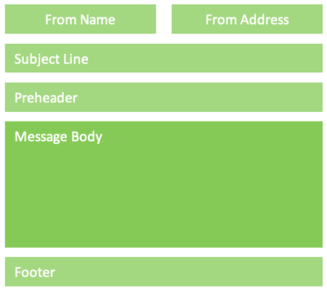
Every email message should follow standard formatting conventions, both to meet customers’ expectations and to comply with technical and legal regulations (such as CAN-SPAM). When a customer opens your message, they should instantly grasp who it is from and why you are contacting them. Follow this advice to make it clear.
- Sender Name and Address: Clearly identify the energy utility or affiliated program that is sending the email.
- Subject Line: Relevant, compelling and actionable; 50 to 70 characters that prompt the customer to open to learn more.
- Preheader: Summary of contents, 35 to 100 characters, that’s consistent with the subject line and inspires action.
- Footer: Must include a physical mailing address and a prominent unsubscribe link to comply with CAN-SPAM regulations.

Make it easy to read
Customers open messages using multiple email programs, web browsers and mobile apps, on a variety of devices, in a variety of situations — from Microsoft Outlook and Gmail on their computers to the Mail app on their phones. In every case, your design needs to be clear and legible.
Often this is easier said than done; a font or color choice may look great on the big computer screen you’re using to design it, but the message may be completely unreadable on a customer’s small smartphone screen. Consider these email best practices to make an impact no matter what devices customers use to read them.
- Always utilize mobile-optimized design. More than 63% of residential customers read emails from their energy utility on smartphones.
- Email attention spans are short. Most customers spend less than 8 seconds reading an email from their energy utility. Make your point instantly.
- Use web-safe fonts to ensure compatibility; body text should be 14 to 16 points.
- Add alt tags to all images to improve clarity for customers who have images turned off and to ensure compliance for vision-impaired customers.
Eye-catching simplicity
Messages need to be attractive, but designs should also be simple and restrained. Complicated color schemes or intricate images won’t display well on all email programs, web browsers or smartphone apps. A design can be bright, bold or eye-catching while still being clear and easy to read. These tips will help you find the right balance.
- When using overlapping or adjacent colors allow for enough contrast to be differentiated by the vision-impaired.
- Don’t be afraid of white space. An airy design prevents your email from looking crowded and allows customers to distinguish the important elements (such as the CTA).
- Place your utility’s logo in the top-left corner, where customers expect to see it. This quickly reassures them that the message is from a company they trust.
- Always use a compelling hero image to attract attention, pique customer interest and help tell your story. All-text messages are easy to dismiss as gray and uninspired.
- Do not embed important text within an image; keep text and visual elements separate. Some websites and email apps do not automatically render images, and the text may be hard to read on smaller screens.
- An animated GIF can be more effective than a still image. Keep GIF image sizes small, limiting the number of frames and compressing the file, to reduce email load times.
CTAs that convert
The goal of your email isn’t to be read and enjoyed — it’s to drive conversions. Optimize calls-to-action within messages and ensure they lead to specific landing pages where customers can quickly and easily sign up for your program. Use A/B testing to find the best CTA, comparing elements such as the message, color, button size and placement until you find the best-performing combination.
- Make sure the intention of the CTA is clear and recognizable, such as “Sign up now” or “Get started.” Customers should know exactly why they are clicking and where to click.
- The CTA button should stand out from the rest of the email, preferably using a dark color on a light background, and it should be large enough that customers won’t miss it.
If your program promotions or communications goals are falling short, the problem might not be the substance of your message — it might be a poorly designed email that customers are quick to delete. By following these best practices, you can optimize the design of your email messages to boost engagement and maximize conversions.

