Americans are spending more time than ever looking at screens. Nielsen Company data shows that screen time for adults in the U.S. has increased to 13.5 hours per day, up from 10 hours per day in 2019.
Our eyes are tired from constantly staring at computer screens, tablets, smartphones and TVs. Dark mode emails can help with the visual strain by lessening the brightness.
There’s also an undeniable “cool factor” of dark mode. Hitting on minimalistic design, many people simply prefer the user experience. Multiple surveys show that over 80% of consumers use dark mode on one or more applications.
So, yes. Your energy utility should be sending dark mode emails.
What is dark mode email?
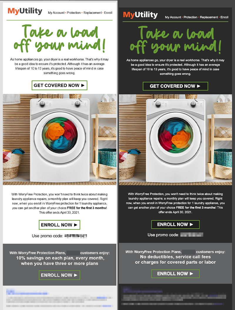
Dark mode email refers to a setting that shifts the color palette of emails to display content in high contrast using dark background colors and a light foreground. Your user interface (UI) inverts light colors to dark and dark colors to light.
The benefits of dark mode email for customers include:
- Less visual strain
- Reduced screen glare
- Aesthetically pleasing
- Lower battery use
The benefits of dark mode email for energy utilities include:
- Meets customer preferences
- Increased deliverability
How does dark mode email work?
To excel with dark mode email, you need to employ a team with both a skilled designer and a developer. You need properly formatted image files and snippets of code to turn on dark mode.
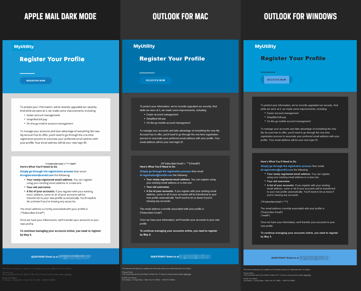
Why? Because dark mode operates differently for every email client. What you see in Gmail is different than Outlook or iOS Mail. Unique code is needed to activate with each client.
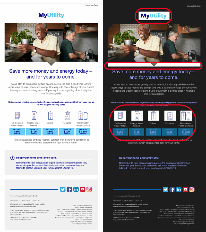
This is where things can get tricky. The inbox may automatically adjust your email to be compatible with dark mode. This is great if your emails are properly coded. If not, non-optimized elements may become unviewable for customers.
Some email clients change nothing, while others will render your email in its original light colors, even to users who have opted for dark mode. This means an overly bright interruption in their email experience.
Developers should be knowledgeable of the functionality of each email client and can help ensure your emails are built correctly and include necessary coding.
How to optimize dark mode email
You should be preparing all emails for light and dark mode. Without that extra thought, you could be sending unreadable communications to your customers.
Here are steps you can take to avoid common mistakes made with dark mode emails and ensure accessibility:
Use transparent images.
This goes for all images. Logos, social icons, section dividers, etc. Use PNG files with transparent backgrounds to prevent a white box from appearing that interrupts the design experience.
Add a white stroke.
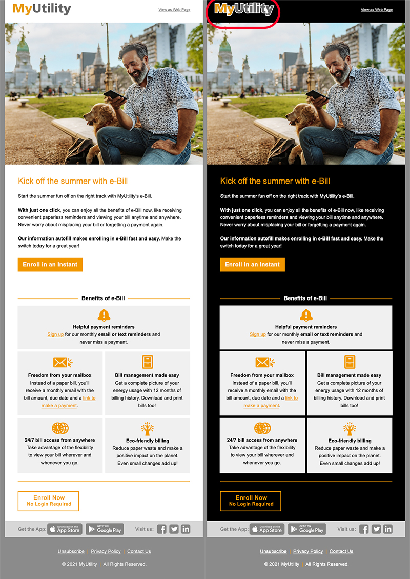
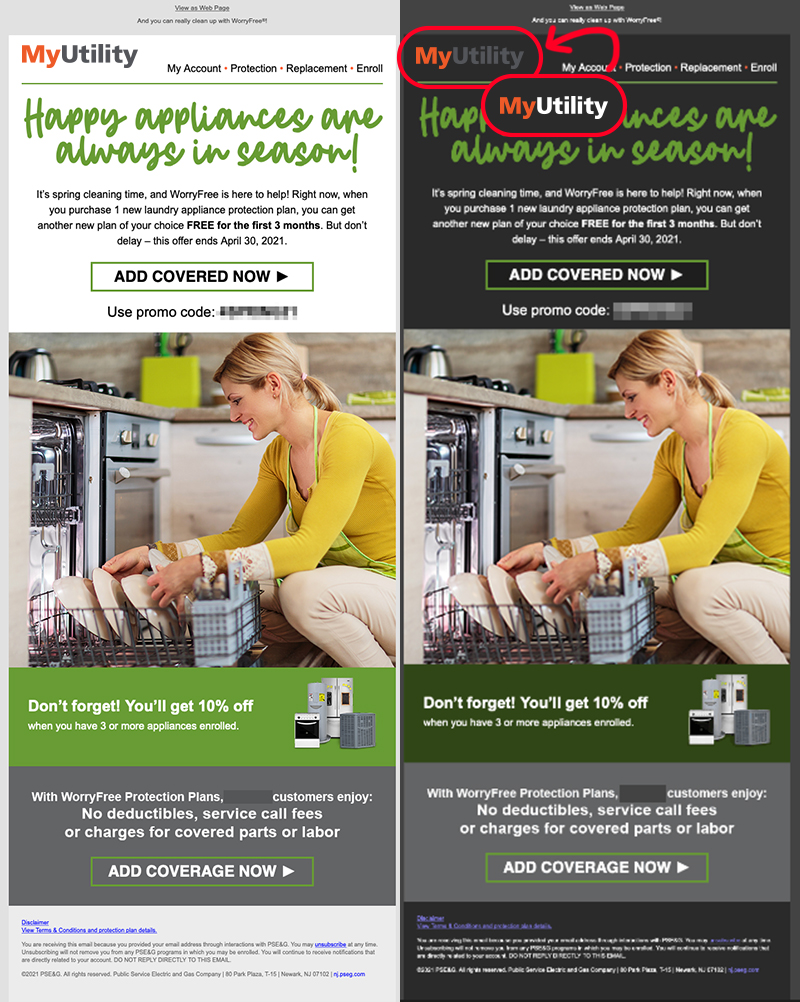
If you have dark text or a dark icon, you can add a white or light outline to make it pop in dark mode.
Make a dark-mode-friendly logo.
Make a reverse version of your energy utility’s logo. This could mean just adding the white stroke mentioned above or creating a reversed color version. Sharing dark-mode-specific design files with your email developers helps them ensure your emails are readable in all formats.
Test for all email clients.
Since not all email clients handle dark mode the same, you should use a tool such as Litmus or work with an email deployment partner to do quality assurance testing. Just because your design looks great in Outlook doesn’t mean it will look right in Gmail. Never send without testing.
Why dark mode email is a must for marketers
Optimization (or lack thereof) affects the way customers engage with your emails, making dark mode impactful to your user experience and deliverability rates. When customers can’t read or see your content, they won’t engage with it, and your deliverability score can decrease.
And by giving subscribers what they want, you show you are listening to their needs. It’s important to provide customers with communications in the formats they prefer.
Without optimization for dark mode emails, you could be sending unreadable messages or frustrating your customers. Take the extra steps to show you care.

