Design plays a powerful role in your energy utility’s marketing strategy. From eye-catching emails to attention-grabbing social media posts, design elements can impact customer engagement and program participation. However, it’s not always easy to know how to improve the design of emails, web pages, social media posts and other marketing materials.

We sat down with Questline Digital Creative Director Joe Pifher — a marketer with two decades of digital design experience — to get his thoughts on best practices for energy utilities. Check out our Q&A below for his expert advice.

What are the best practices you recommend in email design?  

One best practice is to make sure your email is accessible to everyone and complies with ADA (Americans with Disabilities Act) design standards. With so many people using their phones to check their email, your design also needs to be mobile-friendly.

If you want to try new things in your design, you can always use an A/B test to see what works best with your audience. You can A/B test anything — subject lines, calls-to-action, hero images — though you should only test one element at a time. I also recommend running a Litmus test so you can see how the email will look on each platform. For example, Outlook on a PC will not show an animated GIF, but Outlook on a Mac will.

What design elements make an email easy to read?

Today’s consumers don’t have time to read six paragraphs of copy. If possible, find ways to keep your copy simple and don’t cram too much into one message. If you do need to use a large amount of copy, find a way to break it up by using icons, bullets, imagery or a call-out. These elements can help separate each section. You don’t want your readers to get overwhelmed by giant blocks of copy.

How do you choose a photo that resonates with energy utility customers?

I can’t say there is a formula for selecting the best photo. You have to pick an image that is specific to the email and the story you’re telling. Regardless of the topic, you want to find something that is going to grab your audience’s attention, whether it’s a pop of color or an image that pulls at the heart strings.

Often I’ll alter or enhance a photo to heighten the impact. In an interior image, for example, I’ll change a plain white wall to a bright color. Beyond color correction, I’ll find a point of interest in the image and darken or blur around it so your eye is drawn to that focus area.

You also need to make your image relatable and reflect the demographics in your region. You want to have diverse images that include different ages, genders and ethnicities. If you’re coming from a place of authority, it might not be a bad idea to have the subject of the photo look right at the camera, making eye contact with the customer.

Should you use an animated GIF in an email or social media post?

Whether to use an animated GIF depends on a couple things. Timing is a big one. Making a GIF takes a little more time than just supplying a static image. It’s also important to know your audience. If most of your audience is on a PC using Outlook, a GIF isn’t going to show up.

You also want to think about how it will benefit your campaign. If a GIF is going to help tell your story, then it makes sense to use one. As far as social media, it’s always a good idea to use some form of movement to capture attention.

How can energy utilities improve their social media engagement?    

Our clients know that customers don’t think about their energy utility unless they have to. That’s why you need to have social content that stands out. Think about what you’d like to see when scrolling through your feed. Show consumers that your energy utility is not just an afterthought — you’re relatable and part of the community. Give them something that’s fun or helpful, like a puzzle, video or interactive infographic.

It’s also important to tell a story with social posts. Give your followers something they don’t ordinarily see in their everyday life like a behind-the-scenes look at your energy utility. Perhaps most important, remember to speak to a specific segment of your audience. If you try to talk to everyone at once, you’re probably talking to nobody.    

What’s your take on emojis in subject lines?

I think emojis are a great idea. In my personal email, I get hundreds of emails each day and the ones with emojis catch my eye. Anything that’s going to help an email stand out is beneficial.

If you do add an emoji to a subject line, make sure it’s at the beginning and not the end to ensure customers see it. You can even use emojis in emails to your business customers. You can use a typewriter, check mark or smartphone emoji to make it a little less whimsical. If you’re hesitant to use emojis in a subject line, run an A/B test to find out if a subject line with or without an emoji works best.

Do you have design recommendations for a call-to-action (CTA)?

Keep your CTA simple. Have a good call to action so your readers know why they are clicking on the button and where it goes. Our data shows that a button always performs better than a hyperlink. As far as color goes, I like using whatever brand color we’re using for the hyperlinks or bold copy. Keep in mind, if you have several blocks of copy, your readers may not scroll far enough to reach the CTA button. That’s why I always recommend a button at the top and bottom of a long email.  

What are your thoughts on the use of white space in design?

Just like any other design element, the use of white space needs to have a purpose. If you’re not giving readers’ eyes a place to rest, they aren’t going to take the time to read your content. I can’t tell you the number of times I stopped reading an article or landing page copy because of the lack of white space. White space is a basic element of design — you need it in everything.

What do you recommend for energy utilities with small marketing budgets?

If your energy utility’s budget is too small to afford professional tools like Adobe Creative Cloud, I would suggest finding alternative options. There are many helpful sites for improving your content and design, and many are free or very affordable.

Grammarly is great for writing, while Canva is an easy-to-use platform for creating social posts, infographics and more. You can learn how to use these apps through educational sources like Lynda. Through partnerships with public libraries in many areas, you can use your library card to get a free Lynda membership (that’s how I use it).

Keep in mind, doing creative work in-house will likely help with costs, but not always results. My best advice is to stop worrying about being unique in your marketing if your budget doesn’t allow for it. As much as my team loves creating custom campaigns, financially it doesn’t make sense for every energy utility. Consider using one of Questline Digital’s off-the-shelf campaigns to promote your programs. These campaigns can be personalized with your brand for a fraction of the price of a fully custom project. Plus, they were strategically created to meet the unique needs of energy utilities.

Learn how Questline Digital’s Creative team designs utility marketing campaigns that deliver results.

The coronavirus pandemic continues to bring financial hardship to Americans from coast to coast. According to the latest unemployment numbers, weekly first-time jobless claims remain above 1 million for the 13th week in a row. During this difficult time, many energy utilities are promoting their financial assistance programs and encouraging customers to “pay it forward” to help their neighbors in need.

Lending a helping hand

Many people are interested in helping out in some way. These acts of kindness come in all shapes and sizes, including donating blood, volunteering and supporting local businesses. In fact, 46% of millennials say they want to give more in response to the pandemic.

Most people simply aren’t aware they have options to give back through their energy utility. Here’s a few examples of energy utility programs that provide customers with the opportunity to help their neighbors and community.

Entergy’s COVID-19 Emergency Relief Fund: Established by the Entergy Charitable Foundation, this relief fund is dedicated to helping customers affected by the pandemic. The fund helps customers across multiple states, including Arkansas, Louisiana, Michigan, Mississippi, New York and Texas. In partnership with the Baton Rouge Area Foundation, Entergy Louisiana created Fueling the Fight, a program that covers costs of providing meals to healthcare workers on the frontline of the pandemic. The energy utility is matching individual donations up to $50,000.

AEP Ohio’s Neighbor to Neighbor Program: This assistance program helps customers facing financial hardship maintain or restore their basic electric service. For customers looking to give back, the energy utility will match every donation, and 100% of proceeds help a local family in need. Customers have the option to donate through their AEP Ohio bill.  

Mississippi Power’s Project SHARE: For as little as a dollar a month, customers can help make a difference for elderly or medically disabled customers. To make it easy, customers can add their desired donation when they pay their utility bill. Since its inception, Project SHARE has received more than $900,000 donations from customers and employees.

Eversource Energy’s Neighbor Helping Neighbor Fund: In partnership with six community action agencies, this program helps energy utility customers who are unable to pay their utility bill due to temporary crises like the COVID-19 pandemic. Eversource provides their customers with the opportunity to make a one-time online donation or set up recurring contributions through their monthly bill. 

As the pandemic continues, energy utilities should promote their financial assistance programs as well as the opportunity for customers to donate to the cause. Many customers are looking to pay it forward and help their neighbors get back on their feet.

Questline Digital’s Payment Assistance Campaign can help you ease customer concerns and connect them with the right resources.

Email marketing is an extremely effective channel, giving energy utilities the ability to reach a large number of customers with highly targeted, personal messages. But even the best email campaigns must compete for clicks in crowded customer inboxes.

In order to succeed, an email must be clear, consistent and easy to read. With well-designed messages that attract attention and drive conversions, energy utilities can cut through the clutter to deliver successful results. Follow these best practices to optimize the design of your emails.  

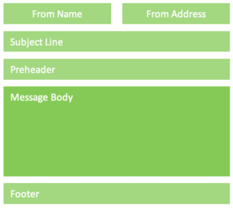
Anatomy of an email message

Every email message should follow standard formatting conventions, both to meet customers’ expectations and to comply with technical and legal regulations (such as CAN-SPAM). When a customer opens your message, they should instantly grasp who it is from and why you are contacting them. Follow this advice to make it clear.

  • Sender Name and Address: Clearly identify the energy utility or affiliated program that is sending the email.
  • Subject Line: Relevant, compelling and actionable; 50 to 70 characters that prompt the customer to open to learn more.
  • Preheader: Summary of contents, 35 to 100 characters, that’s consistent with the subject line and inspires action.
  • Footer: Must include a physical mailing address and a prominent unsubscribe link to comply with CAN-SPAM regulations.
Diagram of different sections of an email message

Make it easy to read

Customers open messages using multiple email programs, web browsers and mobile apps, on a variety of devices, in a variety of situations — from Microsoft Outlook and Gmail on their computers to the Mail app on their phones. In every case, your design needs to be clear and legible.

Often this is easier said than done; a font or color choice may look great on the big computer screen you’re using to design it, but the message may be completely unreadable on a customer’s small smartphone screen. Consider these email best practices to make an impact no matter what devices customers use to read them.

  • Always utilize mobile-optimized design. More than 63% of residential customers read emails from their energy utility on smartphones.
  • Email attention spans are short. Most customers spend less than 8 seconds reading an email from their energy utility. Make your point instantly.
  • Use web-safe fonts to ensure compatibility; body text should be 14 to 16 points.
  • Add alt tags to all images to improve clarity for customers who have images turned off and to ensure compliance for vision-impaired customers.

Eye-catching simplicity

Messages need to be attractive, but designs should also be simple and restrained. Complicated color schemes or intricate images won’t display well on all email programs, web browsers or smartphone apps. A design can be bright, bold or eye-catching while still being clear and easy to read. These tips will help you find the right balance.

  • When using overlapping or adjacent colors allow for enough contrast to be differentiated by the vision-impaired.
  • Don’t be afraid of white space. An airy design prevents your email from looking crowded and allows customers to distinguish the important elements (such as the CTA).
  • Place your utility’s logo in the top-left corner, where customers expect to see it. This quickly reassures them that the message is from a company they trust.
  • Always use a compelling hero image to attract attention, pique customer interest and help tell your story. All-text messages are easy to dismiss as gray and uninspired.
  • Do not embed important text within an image; keep text and visual elements separate. Some websites and email apps do not automatically render images, and the text may be hard to read on smaller screens.
  • An animated GIF can be more effective than a still image. Keep GIF image sizes small, limiting the number of frames and compressing the file, to reduce email load times.

CTAs that convert

The goal of your email isn’t to be read and enjoyed — it’s to drive conversions. Optimize calls-to-action within messages and ensure they lead to specific landing pages where customers can quickly and easily sign up for your program. Use A/B testing to find the best CTA, comparing elements such as the message, color, button size and placement until you find the best-performing combination.

  • Make sure the intention of the CTA is clear and recognizable, such as “Sign up now” or “Get started.” Customers should know exactly why they are clicking and where to click.
  • The CTA button should stand out from the rest of the email, preferably using a dark color on a light background, and it should be large enough that customers won’t miss it.

If your program promotions or communications goals are falling short, the problem might not be the substance of your message — it might be a poorly designed email that customers are quick to delete. By following these best practices, you can optimize the design of your email messages to boost engagement and maximize conversions.

Learn how a digital marketing strategy from Questline Digital will help you build engagement with customers.