
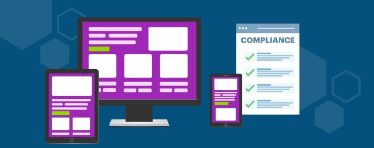
Every utility customer deserves equal access to important information. Whether they’re viewing an outage alert, learning about savings programs or exploring financial assistance, these digital communications should be easy to read, navigate and understand.
Responsive design plays an essential role in creating accessible utility communications. By automatically adapting emails and webpages to different screen sizes and supporting accessibility best practices, responsive design helps every customer confidently engage with their utility.
“Responsive design benefits everyone,” says Sydney Everett, Art Director at Questline Digital. “It makes communications easier to navigate and understand, not only for people with disabilities, but for every utility customer.”
Accessibility Matters
Utilities communicate about information that directly affects customers’ daily lives. Whether announcing planned outages, explaining new rates or providing safety information, utilities have a responsibility to ensure these communications are accessible to as many customers as possible.
Accessibility has never been more important. According to the World Health Organization, approximately 16% of the world’s population — about 1.3 billion people — live with a significant disability. That means one in six customers could encounter barriers when engaging with utility communications if accessibility isn’t a consideration.
While responsive design alone doesn’t ensure full compliance with the Americans with Disabilities Act (ADA) or Web Content Accessibility Guidelines (WCAG), it provides an essential foundation for creating inclusive digital experiences. In fact, many responsive design best practices align with WCAG recommendations, including readable typography, sufficient color contrast, logical content structure and touch-friendly navigation.
For utilities, designing with accessibility in mind isn’t just about reducing legal risk — it’s about ensuring every customer can easily access important communications.
“Responsive design helps ensure utility messages are easier to read, navigate and act on,” Everett notes.
Improving Accessibility With Responsive Design
Responsive design and accessibility truly complement one another. While responsive design is often associated with creating a better mobile experience, many of the same principles also improve usability for customers using assistive technologies, larger text settings or alternative input methods, including keyboard navigation, voice control and screen readers.
Responsive layouts automatically adapt content to fit smartphones, tablets and desktop computers. Instead of forcing customers to pinch, zoom or scroll horizontally, mobile-friendly designs reorganize information into clean, intuitive layouts that make important information easier to find and understand. “People expect websites and emails to work like the apps they use every day,” Everett says. “Most people are looking at this information on their phone, not sitting at a desktop computer, so mobile-first design just makes sense.”
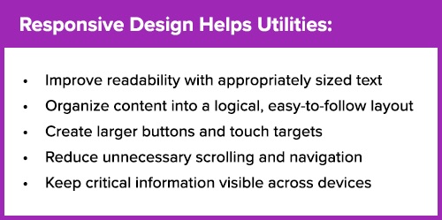
7 Responsive Design Best Practices:
Increase Button Size
Customers navigating with their fingers (versus a mouse) benefit from larger buttons that are easier to tap. Larger touch targets improve usability for everyone and provide support for customers with limited dexterity or mobility.
Ensure Readable Typography
Responsive design adjusts text size, spacing and layouts based on screen size, allowing customers to comfortably read important utility information without excessive zooming or horizontal scrolling.
Create a Clear Content Hierarchy
Customers naturally scan content before reading it in detail. Clear headlines, descriptive subheads and well-defined content sections help customers quickly locate key information while supporting screen readers and other assistive technologies. “The most important information should be at the top, where customers see it first,” Everett explains.
Simplify Navigation
Responsive websites and landing pages reduce unnecessary complexity in utility communications. When customers can quickly locate payment options, outage reporting tools or a program enrollment call-to-action, they’re more likely to take the next step.
Use Intentional White Space
White space is more than a design element — it also impacts accessibility. Adequate spacing between headlines, paragraphs and images reduces visual clutter, lowers cognitive load and makes complex information easier to process. Well-spaced content feels more approachable and helps customers focus on one idea at a time.
“Even if it makes the email a little longer, that breathing room helps customers digest multiple pieces of important information better,” Everett notes.
Prioritize Color Contrast
Strong color contrast helps ensure text, buttons and other important interface elements remain readable for all customers, including those with low vision or color vision deficiencies. Following accessibility guidelines for contrast between text and background colors improves readability in different lighting conditions and on a variety of devices.
Write Descriptive Calls to Action
Calls to action should clearly communicate what happens next. Instead of generic buttons such as “Learn More,” use descriptive, action-oriented language like “Report an Outage,” “Enroll Now” or “View Your Bill.”
Responsive Design in Action
Responsive design principles can be applied across nearly every type of utility communication. From customer welcome and onboarding emails to outage and weather communications, thoughtful layouts help customers quickly understand information and take the next step.
“Utility communications don’t have to be a piece of art — they are pieces of information,” Everett says. “The design should help customers understand the message, not distract from it.”
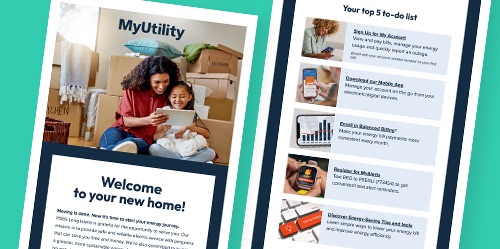
Welcome Series Communications
A welcome email is often a customer’s first impression of a utility’s digital experience. An effective Welcome Series campaign uses clear headlines, large touch-friendly buttons and logical content sections to introduce online account management, billing options and savings resources without overwhelming new customers.
“Your very first communication with a new customer really sets the tone,” Everett says. “If that first email isn’t easy to use or doesn’t help someone find what they’re looking for, they’re probably not going to want to open another email from your utility.”
Billing and Rate Education
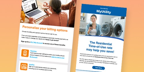
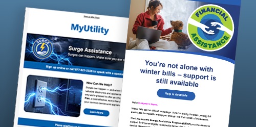
Whether explaining a new Time-of-Day rate or breaking down a monthly bill, responsive layouts help simplify complex information through short sections, clear headings, icons and visual hierarchy. Customers can quickly scan the information most relevant to them instead of reading long blocks of text.
Financial Assistance Programs
Responsive campaign pages make it easier for customers to explore rebates and enroll in programs. Easy-to-understand copy, large and clearly labeled calls to action and mobile-friendly forms encourage greater participation.
Outage Communications
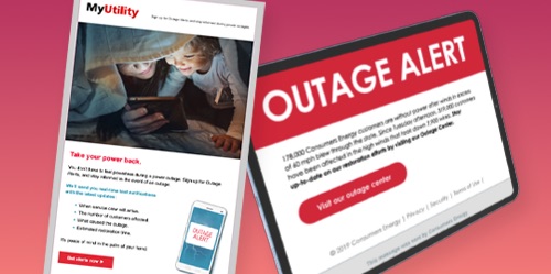
During an outage, customers don’t want to search for information — they want answers immediately. Responsive outage communications prioritize restoration updates, outage maps, safety guidance and reporting tools at the top of the page.
Accessibility Builds Trust
Every customer interaction is an opportunity to demonstrate that your utility values inclusive communications. When customers can easily find the information they need, they’re more likely to trust their utility as a reliable source of guidance and support.
“Utilities really need to be the trusted advisor,” Everett says. “Customers rely on them for information that impacts their home, their finances and sometimes even their safety. Accessible design choices play an important role in reinforcing that trust.”
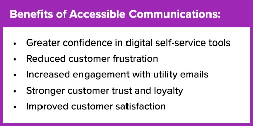
Customers who can quickly access important information without struggling to navigate a website or email are more likely to engage with utility communications and adopt self-service tools with greater confidence. Over time, accessible utility communications can reduce frustration, strengthen relationships and lead to long-term customer satisfaction.
Building a Better Experience for Every Customer
Responsive design is no longer simply about optimizing communications for mobile devices. It’s about ensuring every customer — regardless of ability, device or situation — can access the information they need.
As utilities continue expanding their digital engagement strategies, responsive design will play an increasingly important role in delivering better customer experiences, strengthening trust and helping customers access the information and services they need.
“Responsive design should remove barriers — not create them,” Everett says. “The easier it is for customers to read, understand and act on a communication, the more successful that communication becomes.”